Colors fill our world with meaning. I see blues in the sky every morning, greens in plants, and reds in flowers.
Each color affects how we feel and think. Red roses make me feel warm, while blue skies bring calm. Green plants give me peace.
Understanding colors helps us make better choices. It’s not just about what looks good but how colors work together and affect our mood.
Think about your bedroom walls or the clothes you pick – these choices matter because colors shape our daily lives.
Scientists study how our eyes see colors and how our brain understands them.
Basic Colors
Primary Colors
I often start with the most basic building blocks of color.
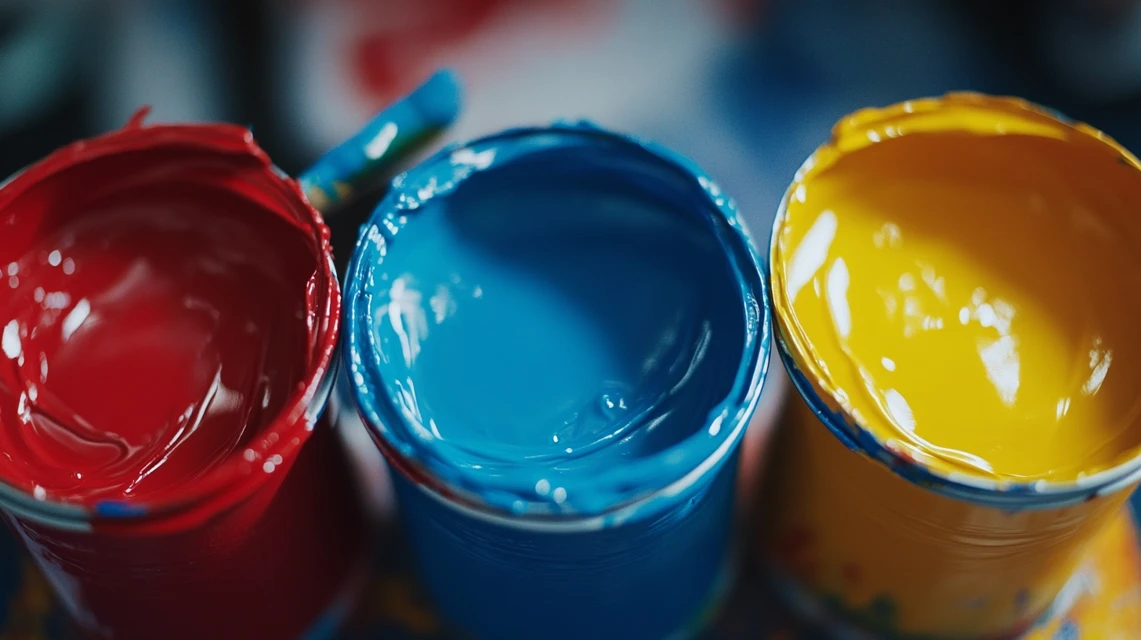
Primary colors are the foundation – they can’t be made by mixing other colors together.
When I work with colors, these are the ones I always start with:
- Red (like fresh apples)
- Yellow (like bright sunlight)
- Blue (like a clear morning sky)
Interestingly, all the other colors are incorporated into these three. That’s why we call them primary – they’re first and pure.
These colors are always in my basic toolkit when I paint or create art. They’re like the ABCs of the color world.
Secondary Colors
When I mix two primary colors, something magical happens. I create secondary colors. Here’s what I get when I mix them:
- Green (mix blue and yellow)
- Orange (mix red and yellow)
- Purple (mix red and blue)
I see these colors everywhere in my daily life—green shows up in trees and grass.
Orange appears in sunset skies. Purple decorates spring flowers.
Nature uses these colors to paint our world. I’ve noticed how these colors appear differently in various places, from gardens to markets to paintings.
Tertiary Colors
Sometimes, I need colors that sit between primary and secondary ones.
That’s where tertiary colors come in. I make these by mixing a primary color with its nearest secondary color.
Here are the ones I use most:
- Red-orange (like sunset)
- Yellow-orange (like marigolds)
- Yellow-green (like new leaves)
- Blue-green (like ocean water)
- Blue-purple (like twilight)
- Red-purple (like wine)
These colors give me more options when I create. They help make smooth changes between other colors.
VIBGYOR
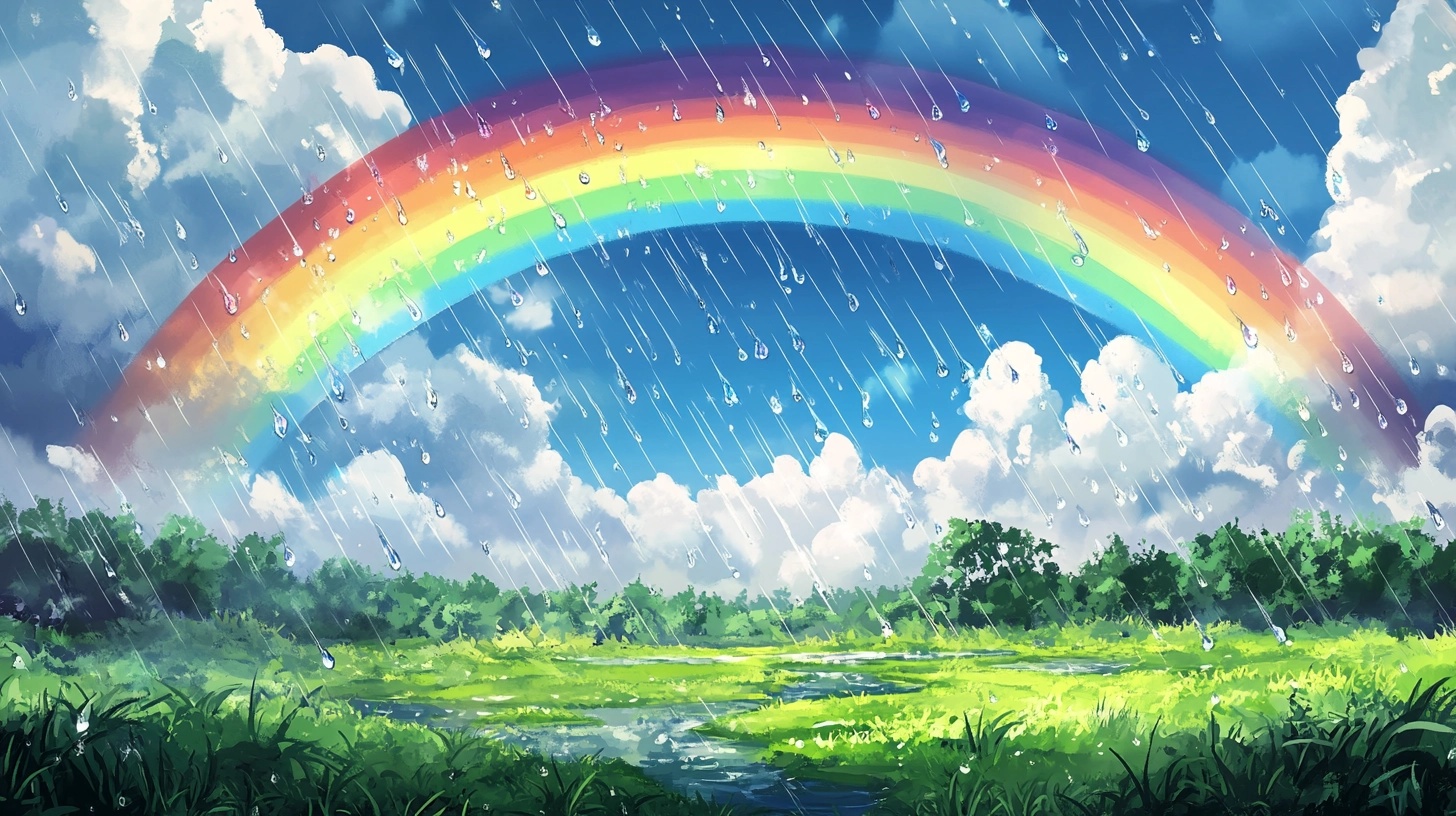
I learned about rainbows through this simple word: VIBGYOR. Each letter stands for a color I see in the sky after rain:
- Violet (top of the rainbow)
- Indigo
- Blue
- Green
- Yellow
- Orange
- Red (bottom of the rainbow)
I often see these colors when sunlight meets water drops in the air.
It’s like nature’s light show. This happens because sunlight splits into different colors when it passes through water.
I find it wonderful how such a simple thing can create such beauty.
More Colors with Their Hex Codes
| Color Name | Hex Code |
|---|---|
| Absolute Zero | #0048BA |
| Acid Green | #B0BF1A |
| African Violet | #B284BE |
| Aero | #7CB9E8 |
| Air Superiority Blue | #72A0C1 |
| Alice Blue | #F0F8FF |
| Alizarin | #E32636 |
| Alloy Orange | #C46210 |
| Almond | #EFDECD |
| Amaranth Deep Purple | #9F2B68 |
| Amaranth Pink | #F19CBB |
| Amaranth Purple | #AB274F |
| Amazon | #3B7A57 |
| Amber | #FFBF00 |
| Amethyst | #9966CC |
| Android Green | #3DDC84 |
| Antique Brass | #CD9575 |
| Antique Bronze | #665D1E |
| Antique Fuchsia | #915C83 |
| Antique Ruby | #841B2D |
| Antique White | #FAEBD7 |
| Apricot | #FBCEB1 |
| Aqua | #00FFFF |
| Aquamarine | #7FFFD4 |
| Arctic Lime | #D0FF14 |
| Artichoke Green | #8F9779 |
| Arylide Yellow | #E9D66B |
| Ash Gray | #B2BEB5 |
| Aureolin | #FDEE00 |
| Azure | #007FFF |
| Azure (X11/web color) | #F0FFFF |
| B’dazzled Blue | #2E5894 |
| Baby Blue | #89CFF0 |
| Baby Blue Eyes | #A1CAF1 |
| Baby Pink | #F4C2C2 |
| Baby Powder | #FEFEFA |
| Baker-Miller Pink | #FF91AF |
| Banana Mania | #FAE7B5 |
| Barbie Pink | #E0218A |
| Barn Red | #7C0A02 |
| Battleship Grey | #848482 |
| Beaver | #9F8170 |
| Beige | #F5F5DC |
| Big Dip O’ruby | #9C2542 |
| Bisque | #FFE4C4 |
| Bistre | #3D2B1F |
| Bistre Brown | #967117 |
| Black | #000000 |
| Black Bean | #3D0C02 |
| Black Coral | #54626F |
| Black Olive | #3B3C36 |
| Black Shadows | #BFAFB2 |
| Blanched Almond | #FFEBCD |
| Blast-off Bronze | #A57164 |
| Bleu de France | #318CE7 |
| Blizzard Blue | #ACE5EE |
| Blood Red | #660000 |
| Blue | #0000FF |
| Blue (Crayola) | #1F75FE |
| Blue (Munsell) | #0093AF |
| Blue (NCS) | #0087BD |
| Blue (Pantone) | #0018A8 |
| Blue (pigment) | #333399 |
| Blue Bell | #A2A2D0 |
| Blue Jean | #5DADEC |
| Blue Sapphire | #126180 |
| Blue Yonder | #5072A7 |
| Blue-Gray (Crayola) | #6699CC |
| Blue-Violet | #8A2BE2 |
| Bluetiful | #3C69E7 |
| Blush | #DE5D83 |
| Bone | #E3DAC9 |
| Bole | #79443B |
| Bright Lilac | #D891EF |
| Bright Yellow (Crayola) | #FFAA1D |
| British Racing Green | #004225 |
| Bronze | #CD7F32 |
| Brown | #964B00 |
| Brown Sugar | #AF6E4D |
| Bud Green | #7BB661 |
| Burgundy | #800020 |
| Burlywood | #DEB887 |
| Burnt Orange | #CC5500 |
| Burnt Sienna | #E97451 |
| Burnt Umber | #8A3324 |
| Burnished Brown | #A17A74 |
| Byzantine | #BD33A4 |
| Byzantium | #702963 |
| Cadet Blue | #5F9EA0 |
| Cadet Grey | #91A3B0 |
| Café Au Lait | #A67B5B |
| Café Noir | #4B3621 |
| Cambridge Blue | #A3C1AD |
| Camel | #C19A6B |
| Cameo Pink | #EFBBCC |
| Canary | #FFFF99 |
| Canary Yellow | #FFEF00 |
| Candy Pink | #E4717A |
| Cardinal | #C41E3A |
| Caribbean Green | #00CC99 |
| Carmine | #960018 |
| Carmine (M&P) | #D70040 |
| Carnation Pink | #FFA6C9 |
| Carnelian | #B31B1B |
| Carrot Orange | #ED9121 |
| Catawba | #703642 |
| Cedar Chest | #C95A49 |
| Celadon | #ACE1AF |
| Celeste | #B2FFFF |
| Cerise | #DE3163 |
| Cerulean | #007BA7 |
| Cerulean (Crayola) | #1DACD6 |
| Cerulean (RGB) | #2A52BE |
| Cerulean Blue | #2774AE |
| Cerulean Frost | #6D9BC3 |
| Champagne | #F7E7CE |
| Champagne Pink | #F1DDCF |
| Charcoal | #36454F |
| Charm Pink | #E68FAC |
| Cherry Blossom Pink | #FFB7C5 |
| Chestnut | #954535 |
| Chili Red | #E23D28 |
| China Pink | #DE6FA1 |
| Chinese Red | #AA381E |
| Chinese Violet | #856088 |
| Chinese Yellow | #FFB200 |
| Chocolate (traditional) | #7B3F00 |
| Chocolate (web) | #D2691E |
| Cinereous | #98817B |
| Cinnamon Satin | #CD607E |
| Citrine | #E4D00A |
| Citron | #9FA91F |
| Claret | #7F1734 |
| Coffee | #6F4E37 |
| Congo Pink | #F88379 |
| Cool Grey | #8C92AC |
| Copper | #B87333 |
| Copper (Crayola) | #DA8A67 |
| Copper Penny | #AD6F69 |
| Copper Red | #CB6D51 |
| Copper Rose | #996666 |
| Coquelicot | #FF3800 |
| Coral | #FF7F50 |
| Coral Pink | #F88379 |
| Cordovan | #893F45 |
| Corn | #FBEC5D |
| Cornflower Blue | #6495ED |
| Cornsilk | #FFF8DC |
| Cosmic Cobalt | #2E2D88 |
| Cosmic Latte | #FFF8E7 |
| Cotton Candy | #FFBCD9 |
| Coyote Brown | #81613C |
| Cream | #FFFDD0 |
| Crimson | #DC143C |
| Crimson (UA) | #9E1B32 |
| Cultured Pearl | #F5F5F5 |
| Cyan | #00FFFF |
| Cyan (process) | #00B7EB |
| Cyber Grape | #58427C |
| Cyber Yellow | #FFD300 |
| Cyclamen | #F56FA1 |
| Dandelion | #F0E130 |
| Dark Brown | #654321 |
| Dark Byzantium | #5D3954 |
| Dark Cyan | #008B8B |
| Dark Electric Blue | #536878 |
| Dark Goldenrod | #B8860B |
| Dark Green (X11) | #006400 |
| Dark Jungle Green | #1A2421 |
| Dark Khaki | #BDB76B |
| Dark Lava | #483C32 |
| Dark Liver (horses) | #543D37 |
| Dark Magenta | #8B008B |
| Dark Olive Green | #556B2F |
| Dark Orange | #FF8C00 |
| Dark Orchid | #9932CC |
| Dark Purple | #301934 |
| Dark Red | #8B0000 |
| Dark Salmon | #E9967A |
| Dark Sea Green | #8FBC8F |
| Dark Sienna | #3C1414 |
| Dark Sky Blue | #8CBED6 |
| Dark Slate Blue | #483D8B |
| Dark Slate Gray | #2F4F4F |
| Dark Spring Green | #177245 |
| Dark Taupe | #483C32 |
| Dark Turquoise | #00CED1 |
| Dark Violet | #9400D3 |
| Davy’s Grey | #555555 |
| Deep Cerise | #DA3287 |
| Deep Champagne | #FAD6A5 |
| Deep Chestnut | #B94E48 |
| Deep Jungle Green | #004B49 |
| Deep Pink | #FF1493 |
| Deep Saffron | #FF9933 |
| Deep Sky Blue | #00BFFF |
| Deep Space Sparkle | #4A646C |
| Deep Taupe | #7E5E60 |
| Denim | #1560BD |
| Denim Blue | #2243B6 |
| Desert | #C19A6B |
| Desert Sand | #EDC9AF |
| Dim Gray | #696969 |
| Dodger Blue | #1E90FF |
| Drab Dark Brown | #4A412A |
| Duke Blue | #00009C |
| Dutch White | #EFDFBB |
| Ebony | #555D50 |
| Ecru | #C2B280 |
| Eerie Black | #1B1B1B |
| Eggplant | #614051 |
| Eggshell | #F0EAD6 |
| Electric Lime | #CCFF00 |
| Electric Purple | #BF00FF |
| Electric Violet | #8F00FF |
| Emerald | #50C878 |
| Eminence | #6C3082 |
| English Lavender | #B48395 |
| English Red | #AB4B52 |
| English Vermillion | #CC474B |
| English Violet | #563C5C |
| Erin | #00FF40 |
| Eton Blue | #96C8A2 |
| Fallow | #C19A6B |
| Falu Red | #801818 |
| Fandango | #B53389 |
| Fandango Pink | #DE5285 |
| Fawn | #E5AA70 |
| Feldgrau | #4D5D53 |
| Fern Green | #4F7942 |
| Fiery Rose | #FF5470 |
| Fire Engine Red | #CE2029 |
| Firebrick | #B22222 |
| Flame | #E25822 |
| Flax | #EEDC82 |
| Flirt | #A2006D |
| Floral White | #FFFAF0 |
| Forest Green (web) | #228B22 |
| French Beige | #A67B5B |
| French Bistre | #856D4D |
| French Blue | #0072BB |
| French Fuchsia | #FD3F92 |
| French Lilac | #86608E |
| French Lime | #9EFD38 |
| French Mauve | #D473D4 |
| French Pink | #FD6C9E |
| French Raspberry | #C72C48 |
| French Sky Blue | #77B5FE |
| French Violet | #8806CE |
| Frostbite | #E936A7 |
| Fuchsia | #FF00FF |
| Fuchsia (Crayola) | #C364C5 |
| Fulvous | #E48400 |
| Fuzzy Wuzzy | #87421F |
Conclusion
Colors do more than just make things look nice.
In this guide, I’ve shown you how three simple colors – red, yellow, and blue – join forces to create an entire rainbow of possibilities.
We’ve explored how mixing these colors gives us new ones, each with its special meaning.
I’ve shared how colors affect everything from road signs to art galleries.
Whether planning a room makeover, creating art, or choosing an outfit, you now have the basic tools to make smart color choices.
Next time you see a rainbow or paint a picture, you’ll understand the science and meaning behind each shade.

