Creative penmanship catches the eye first. Most readers stop looking at content with hard-to-scan intros that lack clear benefits. But a strong introduction turns casual browsers into dedicated readers.
Who hasn’t felt stuck when putting pen to paper? Letters drawing requires skill, but many struggle with knowing where to begin. This frustration leaves many giving up before they’ve truly started.
Fortunately, simple techniques exist that make lettering approachable for anyone. These methods break down complex shapes into manageable parts, helping create beautiful lettering without years of practice.
This blog offers practical strategies for improving lettering skills quickly. Readers will learn step-by-step techniques, avoid common mistakes, and exercise that builds confidence with every stroke.
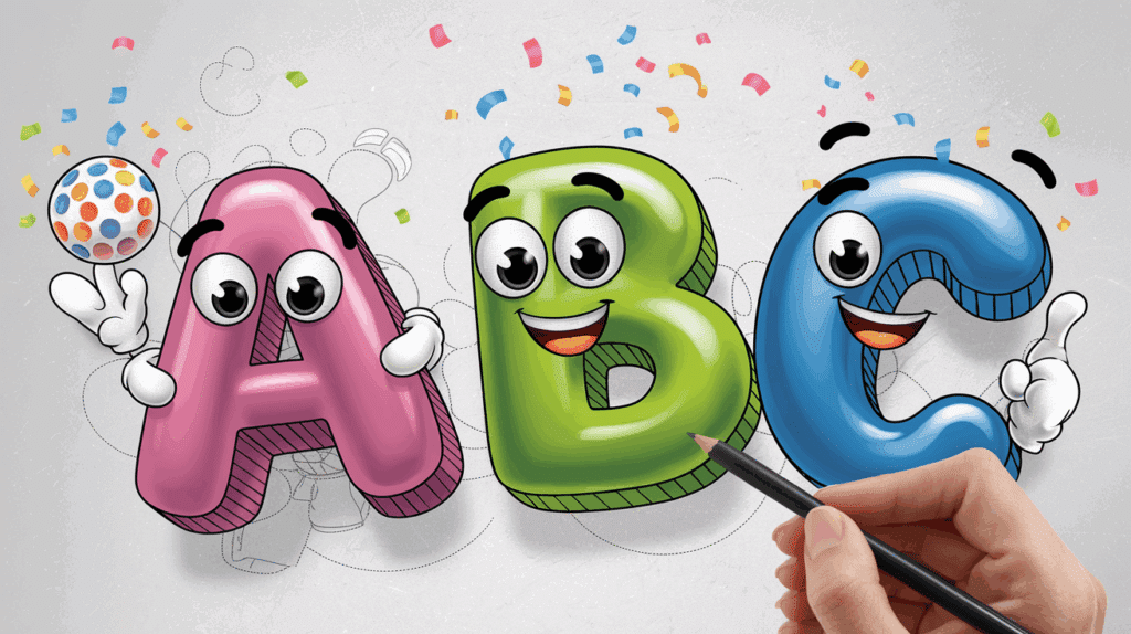
Top Letters Drawing Styles Perfect for Beginners
If you’re just getting started with letters drawing, looking into different styles is a fun way to build confidence and find your creative flow. Below are some beginner-friendly styles that are simple to learn and enjoyable to practice:
- Block Letters – Strong and bold, block letters give you clean lines and help improve your control with spacing and proportion.
- Cursive Letters – Soft, flowing, and connected, cursive is ideal for practicing smooth hand movement in letters drawing.
- 3D Letters – A fun challenge that adds depth to your drawings. Start simple with shadows and gradually build your perspective skills.
- Graffiti Style – This urban-inspired style is bold, expressive, and great for experimenting with creativity and shapes.
- Outline Letters – Easy to create and perfect for adding color later. These help you focus on the form of each letter.
- Doodle Letters – Add patterns or tiny sketches inside each letter for a creative twist that’s totally your own.
How to Draw Letters in Block Style – Step by Step
Drawing letters can be more than just writing; they can become bold, expressive art! If you’ve ever admired eye-catching titles or signs and wondered how to create them, this simple step-by-step guide is for you.
Even if you’re a beginner or just brushing up, our approach to letters drawing will walk you through creating block-style text that pops off the page.
Let’s get into it and bring your words to life one fun and creative step at a time!
1. Begin with Light Lines Using Your Name
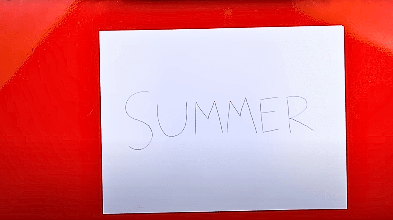
Start your letters drawing by gently sketching your name in capital letters across the page. Keeping your lines light makes it easier to adjust and erase as needed.
Your name is a great place to begin since you’re already familiar with its shape. Focus on maintaining even spacing and consistent size throughout.
This light sketch becomes the framework for everything that follows in your letter-drawing process. Take your time; it’s a fun way to ease into creativity.
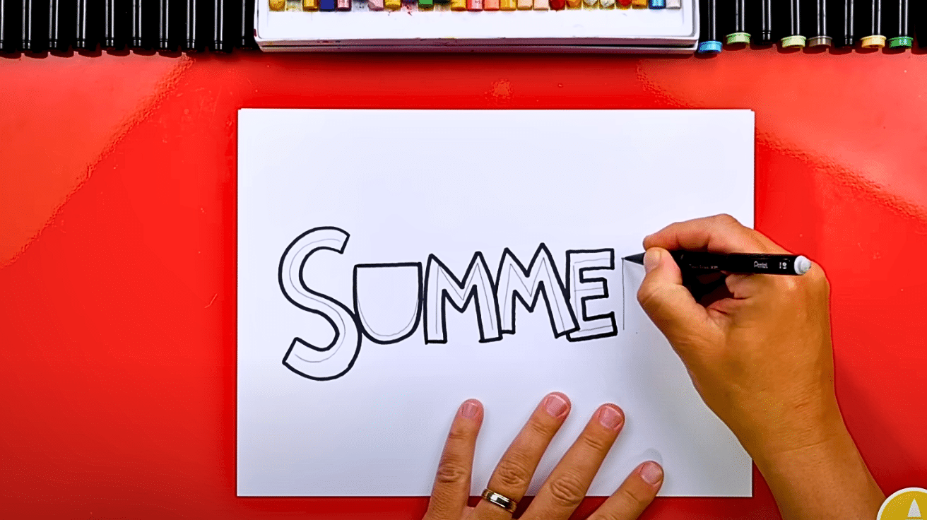
2. Outline Around Your Letters with Style
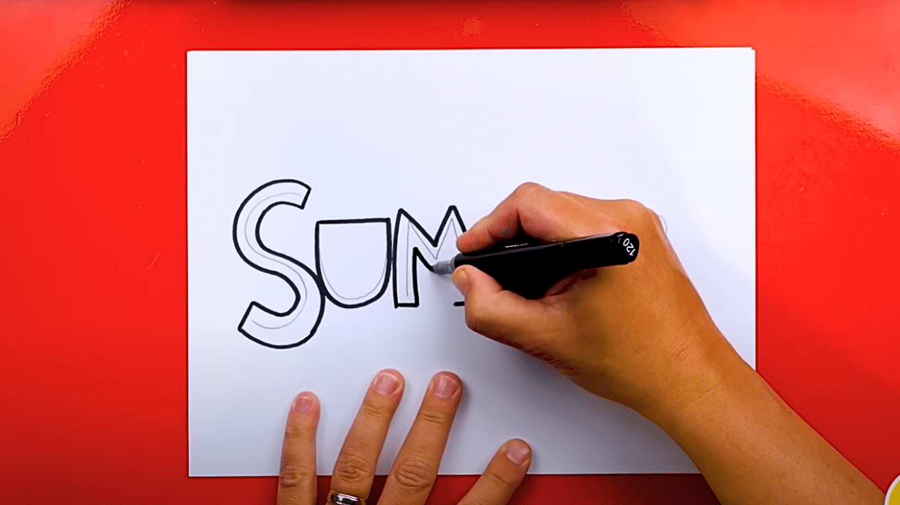
After sketching your name lightly, it’s time to bring those lines to life by outlining them. This step is where your letters drawing begins to take form.
- Use soft, rounded curves for a bubble-letter effect.
- Prefer sharp, structured angles for a blockier, modern feel.
- Trace your outline confidently with darker strokes.
Even if your style is playful or bold, this outer contour alters plain writing into a unique letters drawing that reflects your creativity and personal flair.
3. Play with Overlaps for Visual Interest
In this part of your letters drawing, try overlapping some letters for added depth and creativity. You can make one letter go in front or behind another it’s all up to your imagination.
Start with the light sketch as a base and confidently choose which letters to bring forward or push back.
This technique gives your drawing more personality and helps it stand out. A small adjustment like this can make a huge visual impact with very little effort.
4. Adjust the Perspective for Lively Views
You can make your letters drawing even more Lively by switching the direction of your perspective. Just shift the parallel lines from the corners in the opposite direction, and follow through with matching connections.
This trick is called “fool’s perspective,” and while it’s simple, it adds amazing character. Try both views to see which one suits your creative goal or message best!
5. Use Colours to Create a Realistic Finish
Colours give your letters a finished and professional touch by adding contrast and depth.
- Decide on your light source top-left or top-right.
- Shade the opposite sides of each letter using soft pencil strokes or markers.
- Blend if needed to create smooth transitions.
This added contrast helps the letters stand out, making your artwork feel polished and alive. Though optional, this step can dramatically enhance the impact of your letters drawing with just a few strokes of detail.
Mistakes to Avoid when Drawing Letters
When you’re learning letters drawing, it’s easy to fall into small habits that can slow down your progress. Being aware of these common mistakes can help you build stronger, cleaner, and more confident letter designs right from the start.
Rushing the Outline: Take your time. A shaky or uneven outline can throw off the entire look of your letter.
Ignoring Guidelines: Skipping basic guidelines (like baselines or center lines) makes spacing and alignment inconsistent.
Using the Wrong Tools: Trying detailed styles with thick markers or worn-out pencils can limit your control and precision.
Inconsistent Letter Size: Not keeping a uniform height or width across letters can make your drawing look messy.
Skipping Warm-Up Sketches: Jumping straight into final letters drawing without warming up can lead to stiff, awkward strokes.
Not Practicing Basic Shapes First: Every letter is built from simple shapes. If those shapes aren’t solid, the letter won’t be either.
Wrapping Up
Every letter created shows growth in skill. The techniques shared here offer a starting point for anyone who wants to improve their handwriting or artistic expression.
Keyword selection plays a crucial role in this process, as it helps focus practice on specific letter forms that need attention.
Learning to draw letters takes time and patience. Small wins matter. Daily practice builds muscle memory and confidence. Soon, what once seemed difficult becomes second nature.
Remember that perfection isn’t the goal; progress is. Each person’s style develops differently. The keyword approach allows for personalized learning paths that match individual needs and interests.
The joy of creating beautiful letters comes from the experience itself. Each stroke, curve, and line adds to a growing ability that will continue to develop with practice.